

One of my earliest posts was about how poorly experts can be in predicting the future, despite good data from recent trends. A second post a few days later added fuel to that fire.
Then in my feed arrived the following graph, which is the most amazing version of this pattern, showing the reality of solar installations vs. historic forecasts.
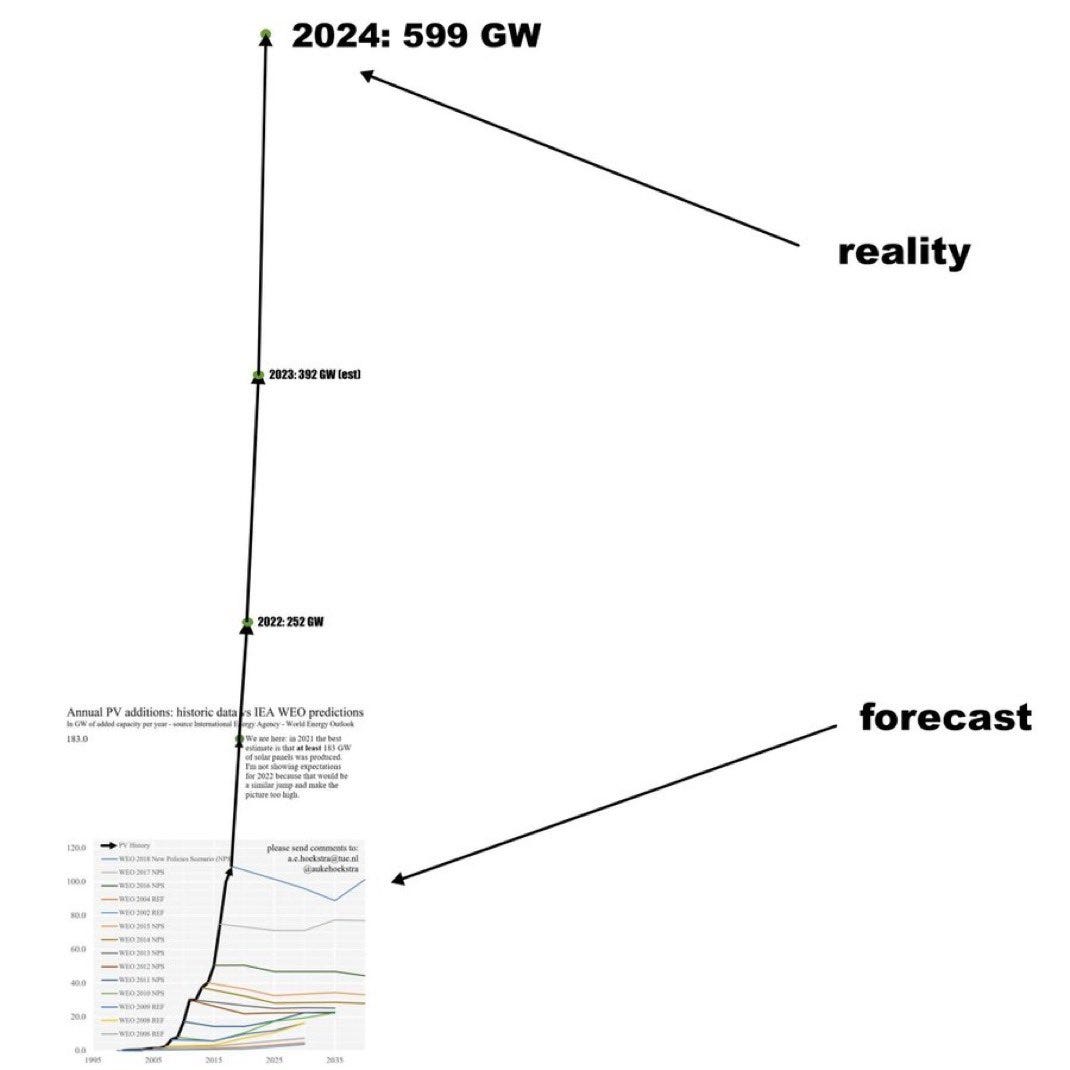
The good news is that in this case, the mistake is the reality of how quickly the world is transitioning to clean, solar power.

(More) Predictions and Reality
·

After posting yesterday’s view of Predictions and Reality, I came across a tweet posting the same graph from the Fed and asking for other graphs showing how terrible predictions can be.