


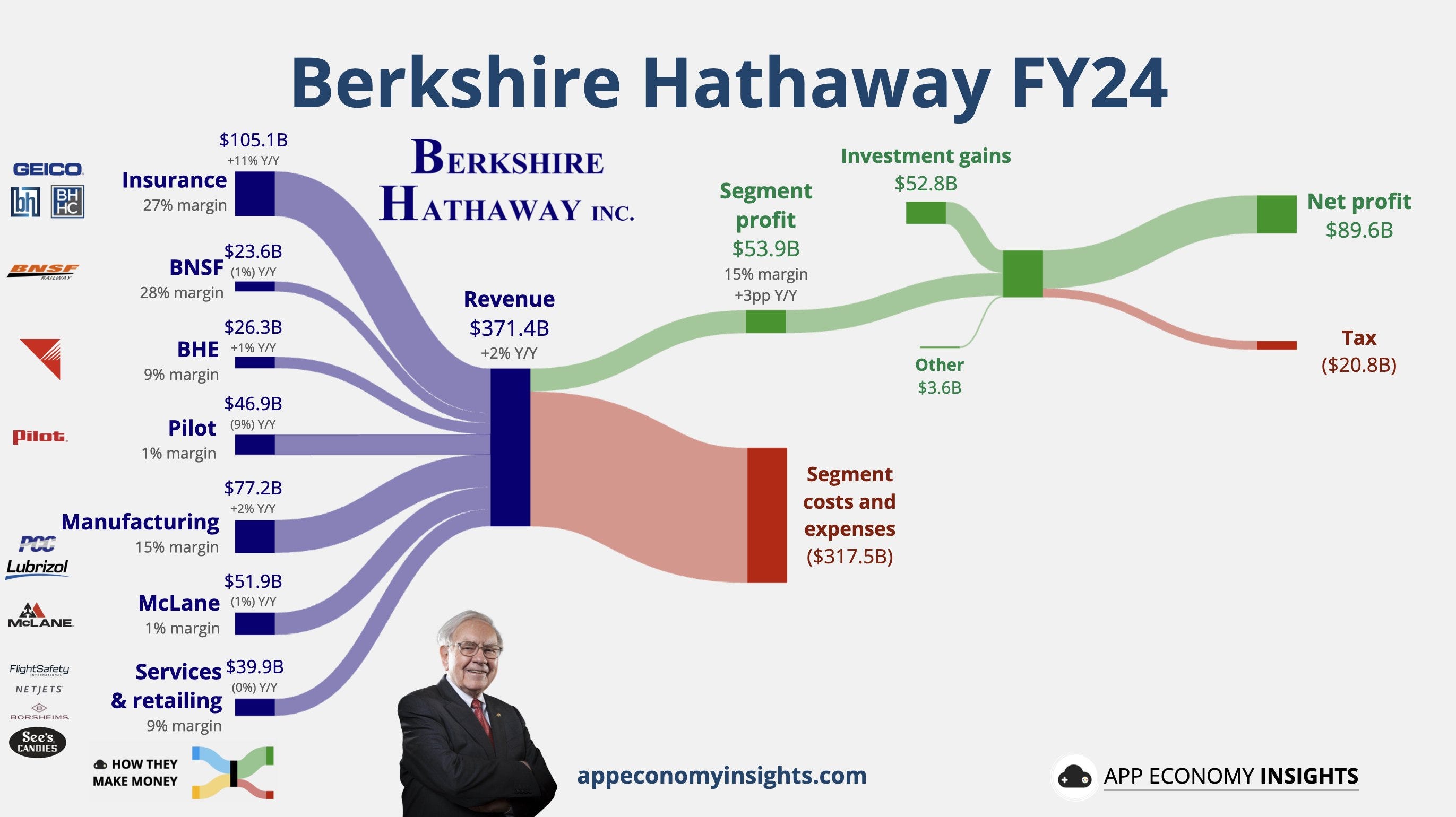
Income Expense Profit flow Diagrams

Have you seen these infographics summarizing the flow of revenues, expenses, and profits? These are produced by appeconomyinsights.com. I’m a very visual learner and find these diagrams a far far faster way to understand the profitability of businesses, and find it fascinating to compare the flows of money between a company like Berkshire Hathaway, Apple, Amazon, Costco, and more.
This also inspired me to create something similar for Africa Eats, my Berkshire-inspired invesment company. Historically we’ve been measuring the aggregate revenues of our bizi across the last decade, but we’ve been focused on the growth of their revenues more than any other metrics.
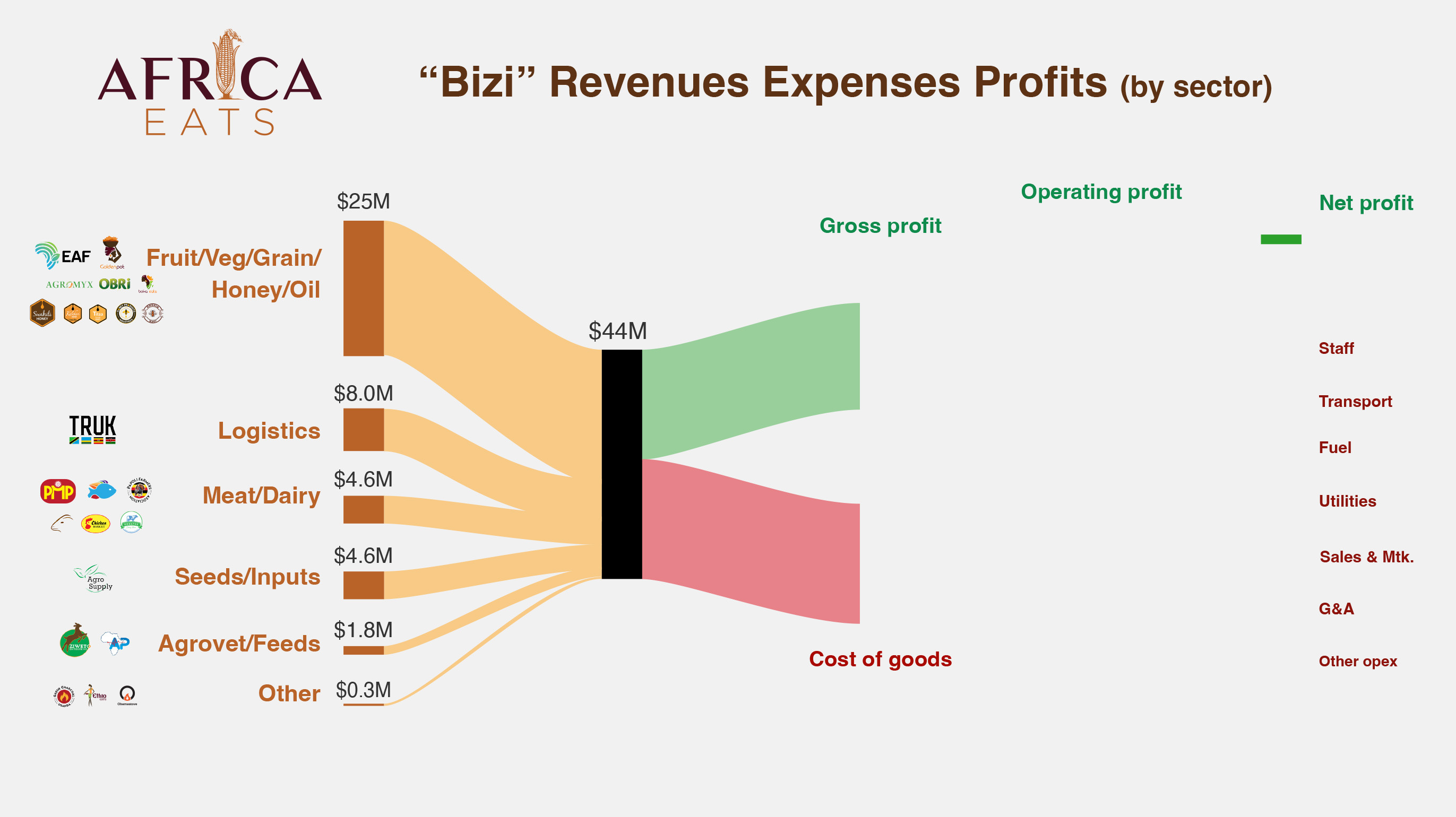
Above is a work the work in progress. The learning so far is that this diagram looks simple, and for a single company is probably just an hour of work. But for our investment company we need to gather and review almost two dozen income statements, then normalize and aggregate those values. It is not yet 70 days since the end of the year and we’re most of the way through that process, but not done yet.
Nontheless, I thought it worth sharing the left half of the diagram, and to see if this readership agrees with me in the value of these diagrams.